Source: Lego - Kids shouldn't watch too much tv http://www.asdlabs.com/blog/2009/09/11/lego-kids-shouldnt-watch-too-much-tv/
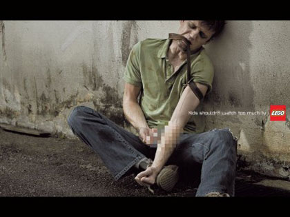
In 2009, Lego developed an advertising campaign with three different images. The main slogan of the advertisement was “Kids shouldn’t watch too much TV”. The toy company thought that although television is a great source of entertainment, it may also contain some contents that are not suitable for children.
In view of this, Lego developed a series of advertisements, suggesting Lego blocks could help to keep children away from the television and provide a good alternative for them to have fun. The images of the three advertisements were taken from scenes of TV programmes about drugs, sex or violence. The one selected for analysis is about taking drugs.
In the image, there was a man with dirty clothes sitting on the ground. He looked tired or sick as his hair was messy and he had big dark circles around his eyes. He was confused as he was frowning. These also made him looked like a poor guy or a bad guy. He tied a belt tight on his left arm. He was also holding something in his right hand but it was censored and cannot be seen.
Although an important part of the image could not be seen clearly, it is easy for an adult to recognize that the guy was taking drugs. It is a stereotype that a drug addict would look like the man in the advertisement. This made it a controversial advertisement. Although Lego aimed to target the advertisement to the parents, it was still a toy company which manufactures toys for children. Therefore, it is expected that the company would have a positive image, so that is could produce fun and healthy toys. However, the advertising campaign was too aggressive. The TV scenes chosen were too violent or unhealthy for kids. If the kids saw those images, they might be negatively influenced. So, it would also build a negative image of Lego in the parents’ minds, as the company did not consider the influences to children before developing the campaign.
The photo essay Hong Kong: Anger and Protest as City Marks 15 Years Since Its Return to China was chosen from Time World. They were taken on the 30 June and 1 July 2012. There are ten photos in total, which can be divided into two main themes, the protests of Hong Kong people, and the official activities to celebrate the return to China and inauguration ceremony of the new Hong Kong leader.
The photographer skillfully placed the photos of the two themes in-between each other’s, which showed a big contrast between the protests situation and the official activities. It also showed the big gap between the Hong Kong government and its people.
From the first three photos, we can see that many of the Hong Kong people were protesting against the new Hong Kong Chief Executive Leung Chun-ying right after his inauguration ceremony. While Leung was swearing-in in the grand hall vowing to make Hong Kong a better place, thousands of people with anger was protesting on the street, showing their unwillingness to receive this new leader.
I like the forth and the fifth photos the most. Both of them showed people lining up with well order, but their purposes were totally different. The forth was the variety show celebrating the 15th anniversary of the handover. If was colorful and people was jubilant. But in the next photo, people were demonstrating. The color was dull, and the red banner in the middle captured the attention, and also showed how people dissatisfied with the China government.
The last two photos are also powerful. They were taken at night. The ninth was the fireworks show which was to celebrate Hong Kong’s return to China. It supposed to be happy and hopeful about tomorrow. But then, the following photo showed a protester holding a colonial Hong Kong flag. He looked sad and disappointed, which indicated how the 15 years rule of China disappointed the Hong Kong people.
 Figure 1 Source: SCMP http://www.scmp.com/news/hong-kong/article/1317566/former-icac-chief-timothy-tong-grilled-spending-lawmakers  Figure 2 Source: Ta Kung Pao http://news.takungpao.com.hk/hkol/topnews/2013-06/1660193.html Former ICAC chief Timothy Tong was being asked questions on spending during his reign by the lawmakers in Legco. Two photographs were taken from SCMP and Ta Kung Pao respectively for analysis.
Figure 1 was taken from SCMP, showing Tong holding his hands and slightly lowered his head. This showed his tiredness and guiltiness. The lighting was dim, which made him look like a bad guy with lots of unrevealable secrets. The lighting also emphasized his face. From his facial expression, it can be found that he was confused and maybe worried. As a whole, the photograph created a negative image for Tong.
However, for the same issue, figure 2, which was taken from Ta Kung Pao, was very different from the previous one. In this photo, Tong was speaking confidently. He was holding a fist in front of him, making him appeared to be strong and powerful. Compared to figure 1, the lighting in figure 2 is much brighter, making Tong seemed like a good guy. Obviously, figure 2 was trying to create a positive image for Tong.
The two photographs were carefully selected by the editors of SCMP and Ta Kung Pao respectively. For SCMP, its political stance is relatively unclear. Therefore, it chose a photo showing Tong looked bad as he was accused. In contrast with SCMP, ta Kung Po was funded by PRC and was known as a pro-government newspaper. It explained why its editor chose a photo that might help the Former ICAC chief to rebuild his image.
 Privacy Apathy by Political Cartoonist Rick McKee The editorial cartoon “Privacy Apathy” was released after Edward Snowden revealed that the US government keeps spying on its people’s personal communication, including emails and phone calls.
In the cartoon, there are two men. The man in black who looked like a spy in movies held a suitcase with the words “NSA” on it represented the National Security Agency (NSA), and it gives a background to the cartoon that it was happened in America. So, the other man who dressed like a construction worker can be interpreted as representing the general public of the America.
From the dialogue of the construction worker, it can be found that he did not care much about his privacy as he thought he had nothing to hide. But then, when he tried to tell the man who is representing NSA about his daily conversation with his friend, he found that he had already know it.
This editorial cartoon aimed at raising the awareness of the American people in protecting their own privacy from the government. The author was trying to show the audiences how horrible and serious it will be if the person who is beside you may know every single piece of details of your life, even the casual conversations with friends. It also showed the negative attitude of the author towards the intrusion of personal privacy of the US government. Therefore, the author is trying to tell the audiences that even there is nothing to hide, it is still important and they still have the right to keep their personal data and privacy to their own.
 Exorcise in Style by Matt Madden I like the comic “Exorcise in Style” most. I like it because it is so interesting and dramatic. The original comic is describing the flat life of a man, which is realistic but boring. But for “Exorcise in Style”, it described the dramatic and horrifying night of the same man, which is unrealistic but very interesting. It can be found that using different angles to see the same thing can lead to different interpretation and conclusion. This reminded me that we can always make our lives more interesting by experiencing it in another way.
Compare with the template, this piece of comic kept the original storyline, but added much more descriptions for each frame and had made some modifications on the pictures. These effectively created a totally different atmosphere for the story, and showed that both words and images can have great influences on how people interpret a story.
The template simply described the daily life of a man who stays up late. The plot is flat and there is nothing special for the atmosphere. But in “Exorcise in Style”, the artist successfully created a horrible atmosphere by adding excessive shadows to the pictures. This created a mysterious and scary feeling. Also, with similar dialogue, the adding of descriptions provided some more information for each frame and guided the audiences to understand the story in a different way. The use of many adjectives further help to create the atmosphere for the story.
This shows that the plot is not the only factor that determine whether a story is interesting or not, but the uses of words and images, as they are the critical factors to help the audiences to understand the story. Even for the same plot and dialogue, different use of words and images make different
stories.
|
 RSS Feed